Sunday, October 13, 2013

MongoDB & Tweets: Full text search for the Bay Area

About a month ago I started collecting tweets for the Bay Area and storing them in MongoDB. Now that I have a small collection of data (~1.3 million tweets) I decided to spend my weekend building an application that utilizes the power of MongoDBs full text search. 

This application lets you explore keyword search in space, time and content. Its best understood by looking at the following examples.

1. UC Berkeley explosion


The first example is for the search term: explosion. You can see from the heat-map that spatially the search term is focused mostly at the UC Berkeley campus. Looking at the timeline we can see only one significant event on the evening of October 1st.


The tweet content (text and photos) tell us even more about what happened.


The event above was in fact an explosion on the UC Berkeley Campus which happened at 6:40 p.m Monday, October 1st. It was caused by vandals attempting to steal copper grounding wire from an electrical system.

2. Giants vs Dodgers


The second example is for the search terms: giants and dodgers. You can see from the heatmap that people are talking about this from a lot of places but most of the heat is centered around AT&T Park. Looking at the timeline we can see 3 significant events, these peaks coincide with the 3 days the San Francisco Giants played against the Los Angeles Dodgers.


Once again the tweet content tells us whats happening at a finer level. From the photos we see lots of people at the ballpark.


3. iPhone5


The third and final example is for the search term: iphone5. Not surprisingly the heat for this term is centered on San Francisco and Palo Alto. The timeline shows one significant event September 21st which is the launch day for the iphone5.


Once again the content tells a great story, please exciting, queuing outside the AT&T store in San Francisco, waiting for their new iphone5.


4. Starbucks


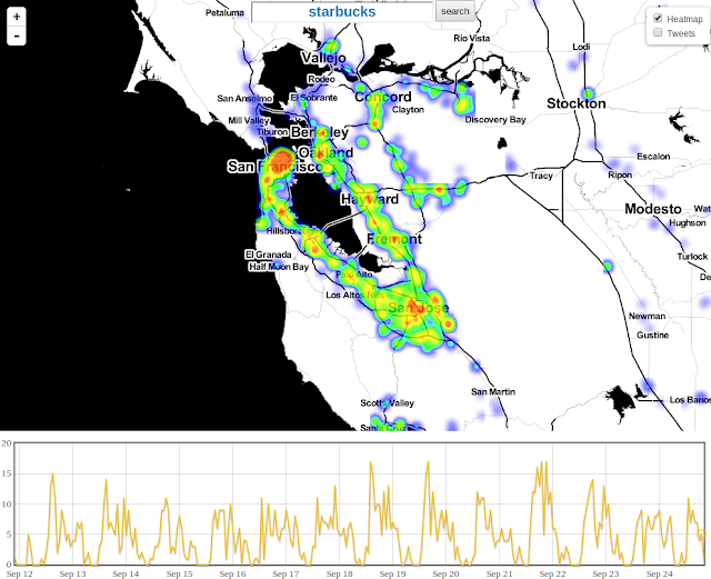
This is a much more general query and therefore guaranteed to return lots of documents. Despite this Mongo, Leaflet, Heatmap.js and Flot still did a great job. What follows was drawn in about 1 second. The photos took a little longer to resolve they just slowly appeared in their own time.


The content of the tweets is as expected.


Final thought


The above is really a testament to the great work done by the MongoDB team. The only reason I was able to build something this cool in a single weekend was because they did such an awesome job. So thank you MongoDB team, I tip my proverbial hat to you.

If your interested in any of my projects consider connecting with me on LinkedIn.

Wednesday, April 3, 2013

The Capital Bikeshare network as a Graph

Recently, I have begun to think of the Capital Bikeshare network as a Graph. Where the stations are the Nodes and the bikes that move among them form the Edges. What would such a graph look like? Well it would contain 191 nodes and 22,694 edges. 22,694 edges is actually not so many, we can still draw this in a web-browser if were smart and use WebGL. 

WebGL rendered graph with 191 nodes and 22,694 edges

If your thinking I can't see any interesting patterns, its too dense your absolutely right and I agree with you. Remember, our visualization is rendered using WebGL so we can explore all day and experience zero lag. We can zoom and pan around, but to be honest we still don't learn very much, apart from the obvious fact that WebGL is awesome.

Zoomed in view containing 2 stations and a lot of edges


Hiding Edges


Okay so the edges are the problem, what if we don't draw them all at once? What if we only draw the edges for a node when we are hovered over it? We end up with a visualization like the following.

Hover and explore, station by station

This isn't a totally useless tool. You can now explore each station in turn and see only the edges that link to/from that station. This is great for finding stations with higher or lower than expected flow or for finding stations with asymmetric flow. It still isn't what we want tho, we want to know more about how the stations interact.

Community Detection


Next, I decided to run community detection algorithms on the Graph. These algorithms will partition the graph into different groups of nodes. There are many different community detection algorithms, to name but a few: Infomap, OSLOM, Copra, Louvain. I have chosen to evaluate the results of two algorithms, Infomap and OSLOM. These techniques are very different in their approach but they should yield similar answers.

Infomap


The fundamental idea behind Infomap really appeals to me. As soon as I finished reading about it, I just had to throw my data at it. In a nutshell: Infomap finds the partition, that minimizes the description length of a binary code, necessary to describe a random walkers movements on a network. I am a visual learner so I consider this visualisation to be the best explanation of Infomap.

One of the most interesting things about the results Infomap returns is the spatial cohesion. The algorithm wasn't given the co-ordinates of the stations. In fact it has no geographic information whatsoever, yet the results are these beautiful, geographically cohesive, communities.

Communities found by Infomap

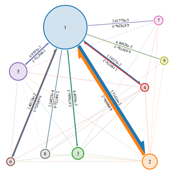
Its not enough to show these communities alone, we also need to see how they are connected and with what strength. For this I have created a force directed layout that displays each community and the links between them. Learning from an earlier example, the link strengths are only displayed when you hover over a node.

OSLOM


Infomap & OSLOM both work on connected directed/un-directed, weighted/un-weighted graphs. They also both find hierarchical community structure. OSLOM is however very different from Infomap, for one, it believes in overlapping communities. This belief allows any node to belong to any number of communities. Also the fundamental idea behind OSLOM is also very different than that of Infomap. In a nutshell: OSLOM compares structures found in your Graph to a completely random graph. It is therefor able to tell if a structure is truly interesting and not just the result of random connections.

Communities found by OSLOM

To describe the overlapping communities I have used pie charts instead of circles for the nodes. OSLOM doesn't weight ownership, so the pies will always be divided into n equal slices where n is the number of communities that the node belongs to. The other interesting thing OSLOM provides is a statistical measure called BS. The BS value for the orange community shown above is 0.136751. BS is an estimation of the probability of finding a module like this one in a random network.

OSLOM overlapping nodes use pie charts to display membership

Conclusion


Infomap and OSLOM both find strong, geographical cohesive, community structure in the Capital Bikeshare network. These algorithms both provide different answers to the question "What is the community structure of this network"? This is however not a surprising result as the exact definition of a community is still an open question. 

Infomap finds communities based on flow. This is very appealing as a bike share network can easily be seen as a flow network. Bikes don't teleport (actually sometimes they do because of the redistribution/balancing trucks) however in general they flow from station to station. If a bike is moved from station a to station b then its next move must begin at station b.

OSLOM finds communities by asking the question "How statistically unlikely am I to find this configuration in a random graph"?

How can we use these communities to our advantage? Well they give us a high level overview of the system. We can almost think of each community as its own bike network. Most of the bike trips stay  within their community, in fact, if this wasn't true then we wouldn't find communities at all. A certain number of bikes do however flow between the communities, these flows are illustrated in the above graph.

About the visualization


The first two graphs use leaflet and WebGL. You might have noticed that I didn't post a URL to the live example, this was done for two reasons. 1) The code is very hacked together and 2) It was an experiment that a friend and I worked on. He did more work than me and he is hoping to take this WebGL network project even further. So I will not be posting his unstable first attempt here.

The second graph was created using Leaflet and D3. Leaflet simply cannot render 22,694 polylines in a fast, lag free way. So this graph actually sparked the idea of creating the WebGL graph.

For the Infomap visualizations, the maps were created using Leaflet and D3 as normal. Initially I drew convex hulls around the communities but I found that this distorted the actually area and overlap of the communities. So I ended up using Alpha shapes instead. I am using 
Ken Clarkson from bell labs implementation. The beautiful force directed graphs were drawn using JSNetworkX which was written by the seriously talented Felix Kling.
For the OSLOM visualizations, the only difference is the pie charts. These were drawn using the leaflet semi-circle extension by jieter.

Thursday, March 28, 2013

Capital Bikeshare: Time Series Clustering

Weekdays on the bike share network are very different from weekends. This becomes very obvious when you plot the total number of rentals, per hour and per day. In the elegant rainbow plot below, it is clear that (Monday to Friday) are incredibly similar. Two sharp peaks are present, the first at 8am (most likely the morning commute) and another at 6pm (most likely the evening commute). Lunchtime (12 to 1) also shows increased activity.  The weekend on the other hand is a completely different graph, there are no sharp peaks, simply a constant increase in activity until midday and then a constant decrease.


This got me thinking, each station must have its own temporal profile, a characteristic time-series that says something about how and when that station is used.  If a station peaks early in the weekday morning and then never again, it could mean that this stations primary purpose is transporting people to work. Likewise if a station peaks at 6pm but never again then it could be considered an evening commute station. Other patterns might also exists that lend themselves to easy interpretation.

So this is exactly what I did. For each of the 191 stations, I computed a time-series by calculating the average number of rentals per hour for that station. I also split the data into weekday and weekend because as we saw above this is very important. 

Normalization


Next I normalized each time-series. I did this because I am interested in the characteristics of the time-series and not the difference in rental volumes. As an example, before normalization the following two time-series have a Euclidean distance of 2025.28 but after normalization they have a Euclidean distance of only 0.39.

Raw rental counts: Station 31245 is approximately twice as busy/popular as station 31018

Normalized rental counts: When we take rental volume out of the picture, we see that these two stations are in fact very similar.

Distance functions


Okay so after we have normalized each stations time-series, we need to choose a distance function. Our time-series objects have a really nice property, they are all of equal length. Each one contains exactly 24 points. There are an infinite number of ways we can compute the difference between two sets of 24 points, so their are an infinite number of distance functions we could use. To name but a few: Euclidean distance (ED)Mean Absolute Error (MAE), Dynamic time warping (DTW). I have decided to use the Euclidean Distance, after all there's only so much 24 points can tell us so their is no sense in over complicating things.

Clustering algorithms


Okay its clustering time, once again there are so many cluster algorithms we could choose from. To name but a few: K-MeansDBSCAN, OPTICS. I have chosen K-Means, why? Well there's a really nice implementation of k-means written in SciPy and I just love Python.

So I ran k-means with k = 3, choose 3 nice colors and plotted each time-series that belonged to each cluster in the following plots. I plotted each individual time-series with a transparency of 0.5 and then plotted the average of these time-series (sometimes referred to as the signature of the cluster) with 0 transparency.
Cluster 1: The morning commute cluster?
Cluster 2: The evening commute cluster?

Cluster 3: Both morning and evening commute cluster?
So what do these clusters look like on a map? Well they seem to make sense. One interpretation of these results is as follows "The majority of stations that are used for both morning and evening commutes (the blue stations) are in the city center. The morning commute stations (the green stations) are presumably used primarily by people travelling to the orange stations, then in the evening the evening commute stations (the orange stations) are used by the same people to travel back home to the green stations."

Map of bike station, colored by cluster membership.

A word of warning, the above is simply one interesting interpretation of these results. There are many possible explanations for such structure. Perhaps there are three types of cyclist, one group that likes to cycle in the mornings but never in the evenings (the green stations), another that likes to cycle in the evenings but never the mornings (the orange stations) and a third who love to cycle both in the mornings and evenings.

Is that it?


Of course not, but this time-series clustering has given me an even better idea, so my next post will be on something related but very different. At some stage I will try to post results which are harder to interpret, when k increases to 4, 5, 6, etc. I may also experiment with OPTICS and see how much the results differ. Also it would be nice to do the exact same analysis for bike returns instead of bike rentals.

About the visualization


As always the above visualizations require a mash-up of tools and frameworks. All of the plots were created using Python and matplotlib. All of the processing (Normalization, Euclidean Distance and Clustering) was done using Python and a combination of Numpy & SciPi. The map is once again powered by Leaflet and D3.

If for some reason you want to explore the live example, you can find it here.

Monday, March 11, 2013

Capital Bikeshare: Space & Time

Capital Bikeshare: Space & Time

This week I've been studying the spatial and temporal components of the Capital Bikeshare data-set. First off what do I mean by the spatial component? Well the bike stations have fixed locations (actually they don't, I'm lying). The stations were actually designed to be movable, they are not fixed to the ground at all (apart from the obvious effect of gravity). They use solar panels to power their rental system software and to log data to a remote server which provides the live availability feed.

According to Capital Bikeshare "Typically a station is only moved due to road construction or some other temporary issue and then it is moved back". Unfortunately this movement data is not contained in the quarterly data dumps so unless you've been logging it for the past few years (which I haven't) then you won't have access to it. If anyone does have access to this data and they would like to share it with me then please leave a comment below.

Anyways back to our discussion about space and time.

This is not a simulator


The first thing I did in order to study the spatial and temporal components was to build a tool which simulates the bikes moving on the network. In reality this is not really a simulator at all because its using the real historic rental data.


The blue dots are the bike stations and the moving red dots are bikes travelling from station to station. The data-set does not contain GPS traces, it contains tuples of (origin, destination, duration) so the red dots are simply moving along an interpolated path from origin to destination where the entire journey takes the correct duration of time.

This is a really interesting exploratory tool, you can move the simulator to any date and time you want, you can also choose from a variety of speeds [1x, 10x, 100x and 1000x]. At 100x you can clearly see different spatial and temporal patterns. You can watch people moving towards the city center during the morning compute and home again during the evening commute. You can watch certain areas of the city light up with activity at different times. You can also use the tool for general exploration, you can watch for example, the very first bike rental which was on Sept 15th 2010 or you can see how federal holidays disturb typical travel patterns for example on Thanks Giving.

If your not satisfied by simply watching the video then you can explore the full data-set yourself by following this link.

You might have noticed that different stations appear as the simulator approaches December 2012. This is because Capital Bikeshare is an ever growing network. If you go all the way back to the beginning of the data-set you will see all of the stations fade away accept for the very first station at 27th & Crystal Dr.


Conclusion


Okay so the simulator is cool, you could use it to watch the entire data-set play out from the very first rental on Sept 15th 2010 until the very last rental (released as of this date) December 31st 2012. Its unlikely that anyone will every do this tho (I certainly won't). I think the simulator is better suited for exploring rental activity on specific dates and or times.

About the visualization


The visualization combines quite a few different elements. The map is being provided by Leaflet an awesome Javascript  library for mobile-friendly interactive maps. You can change the map provider by hovering over the icon in the top right corner of the map. My favorite alternative is the visually appealing Stamen-Watercolor.


The data has been stored in a PostgreSQL database with an index on the time column. This allows the simulator to quickly change to any date/time. Why PostgreSQL? I have found PostGIS and pgrouting very useful for some of my other projects.

The transition animations are being powered by D3. I love D3, it makes this sort of thing so simple and elegant to code. The bike stations and bikes themselves are not actually Leaflet layers. D3 is being used to manipulate an SVG element that is sitting on top of an equally sized Leaflet canvas.

The datepicker is provided by Pickaday. I haven't used this in a project before but I quite like it.
Last but not least, the timepicker is provided by jQuery.


Monday, March 4, 2013

The Capital Bikeshare Data-set


The Capital Bikeshare Data-set

Capital Bikeshare (also abbreviated CaBi) is a bicycle sharing system that serves Washington, D.C.; Arlington County, Virginia; and the city of Alexandria, Virginia. At the time of this writing (Feb 26th 2013), the network contains 1,670+ bicycles serving 175+ stations.

Station Map (Feb 26th 2013)

I really like Capital Bikeshare, not because I love cycling (I do) or because I live in Washington D.C. (I don't) but because of the data. Capital Bikeshare releases all of its historical data on system usage in quarterly data dumps. At the time of this writing, 9 quarters of data have been released the last quarter of 2010; all of 2011; and all of 2012.

The 9 quarters of Capital Bikeshare data

I've been studying this data for the past few months now. The main purpose of this blog post is to share some of my work with you. After all, whats the point in doing something cool if you don't share it.


The effects of weather on bike rentals


The following is a screenshot of an interactive calendar I developed. This calendar displays a square for each day in the Capital Bikeshare data set. The squares are grouped by day, week and month to produce a beautiful mosaic describing bike rentals. The color of each square represents the number of bikes rented from the system on that day. Dark Red means few rentals, Dark Green means lots of rentals. Hovering over any square will display all of the corresponding weather information for that day in the table below the mosaic.


What does this interactive calendar teach us? Well firstly, if we forget about the weather information for a moment, we see some general trends. In 2011 and 2012, the bulk of renting happens in the summer months with reduced activity on either side. We also see that the system is increasing in popularity with time, all of the dark green is in 2012.

More interestingly I think are the oddly colored squares. A red square surrounded by green squares indicates lower than expected rentals, the more contrast the more peculiar. The highest contrast square is Saturday Aug 27th 2011, this was the day of Hurricane Irene. Other days of high contrast (to choose but a few) include

Sat Oct 29th 2011: 29.97mm of rain.
Sun Apr 22th 2012: 32.26mm of rain.
Mon Oct 29th 2012: 97.79mm of rain.
Tue Oct 30th 2012: 21.34mm of rain.

Federal holidays also cause a disruption of normal bike rental usage. Most notably "Thanksgiving, Christmas and New Years".

Click here to view the interactive calendar for yourself. If you find anything interesting that you would like to share, please post it as a comment.

Conclusion


In conclusion weather has a rather dramatic effect on bike rentals. Thorough exploration of the calendar above shows that rain fall is the largest dampening factor (no pun intended) on rentals. This is followed closely by low temperature and then high wind speed. Also most federal holidays appear to have an effect on usage, some positive, some negative, the most influential are of course Thanksgiving, Christmas and New Years. 

So a note to CapitalBikeshare: if you need to do maintenance or upgrades on your network, please, please wait until a rainy day.

About the visualization


The calendar layout I used was created by the seriously talented Mike Bostock. I simply re-purposed it for my own needs. The weather data was downloaded from wunderground.